Introducing a New Streamlined UI for Clerk.io

Great software should be effortless to use.
We believe every user deserves an exceptional experience when using our product. As passionate e-commerce enthusiasts and dedicated problem-solvers, we’re driven to create tools that make your day easy and more productive. This is why we’re thrilled to introduce the latest updates to my.clerk.io
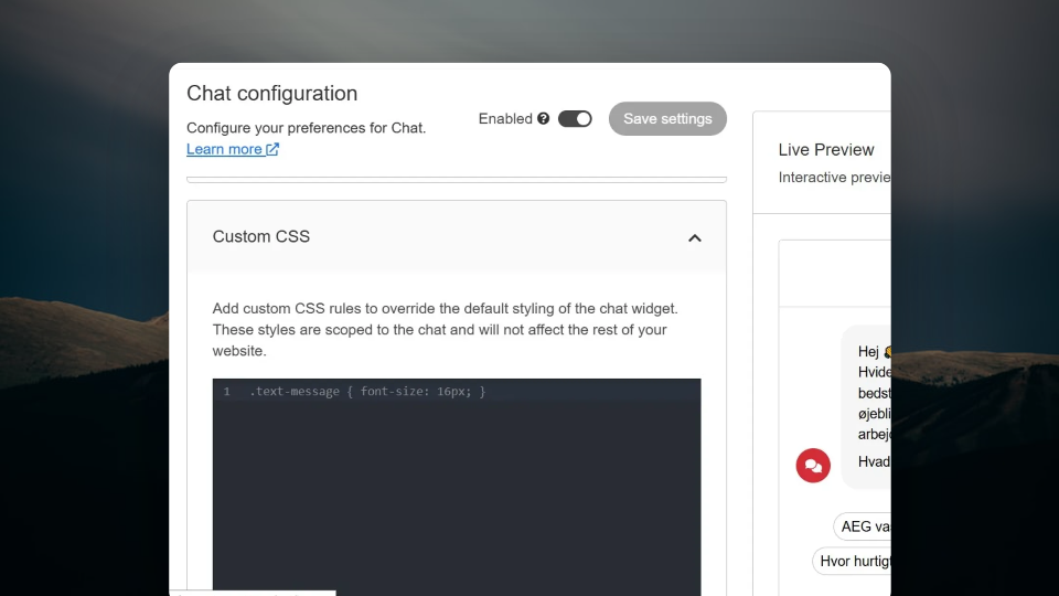
Our refined interface design is now more intuitive, user-friendly, and visually engaging—because we know that great design isn’t just about how it looks but how it works for you.

What’s Changed?
While all functionalities remain the same, the updated look and feel now fully aligns with our brand identity. The new UI offers a cleaner, more modern workspace designed to help you focus on what truly matters: your business’ success.
Here’s a quick overview of the changes you’ll notice:
A New Color Scheme
Say hello to an updated color palette designed to improve readability and focus. The new cohesive design makes navigating and working within the platform easier and more enjoyable.
Enhanced Space
We’ve optimized the spacing across the platform to create a cleaner, more streamlined look. This means faster navigation, less clutter, and a more efficient experience every time you log in.
Updated Components
Buttons, inputs, tables, and other UI elements have been refreshed for a sleek and consistent look, ensuring the platform looks as great as it performs.
Dark Mode is Available
Switch to Dark Mode for a more comfortable experience in low-light settings. It’s easy on the eyes and just as functional. Toggle between light and dark themes anytime.

Stay tuned for more updates as we evolve and improve my.clerk.io to better meet your needs.
Book a FREE website review
Have one of our conversion rate experts personally assess your online store and jump on call with you to share their best advice.


